Production ready
Polymer 1.0 has been rebuilt from the ground up for speed and efficiency. The new, leaner core library makes it easier than ever to make fast, beautiful, and interoperable web components. If you haven't used Polymer before, it's time to try it out. If you haven't tried it recently, time to take another look.
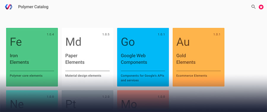
Element Catalog

Custom elements, built by the Polymer team, ready to use in your applications.
Built for Speed
Polymer 1.0 replaces the shadow DOM polyfill with a lightweight shim, uses a new, faster data-binding system, and significantly reduces code size.
For Modern Browsers
Polymer is built from the ground up for modern browsers, using the latest web platform APIs. Polyfills provide support on evergreen browsers for APIs that aren't universal yet.
Using Web Components
Polymer leverages web components, a new set of standards designed to provide reusable components for the web.
Use elements from the catalog
<!-- Polyfill Web Components support for older browsers -->
<script src="components/webcomponentsjs/webcomponents-lite.min.js"></script>

<!-- Import element -->
<link rel="import" href="components/google-map/google-map.html">

<!-- Use element -->
<google-map latitude="37.790" longitude="-122.390"></google-map>
An element built with Polymer looks and works just like any other HTML element. Simply find an element you’d like to use in your app, import it with an HTML import, and then add the tag to your page.
Create your own elements
<dom-module id="contact-card">
  <link rel="import" type="css" href="contact-card.css">
  <template>
    <content></content>
    <iron-icon icon="star" hidden$="{{!starred}}"></iron-icon>
  </template>
  <script>
    Polymer({
      is: 'contact-card',
      properties: {
        starred: Boolean
      }
    });
  </script>
</dom-module>
<contact-card starred>
<img src="profile.jpg" alt="Eric's photo">
<span>Eric Bidelman</span>
</contact-card>The Polymer library makes it easy to create your own powerful elements. Give your element some markup and properties, and then use it on a site. Polymer provides useful features like templating and data binding to reduce the amount of boilerplate you need to write.
Power it all with real data
<dom-module id="friend-list">
  <link rel="import" type="css" href="friend-list.css">
  <template>
    <firebase-collection data="{{data}}"
                      location="https://users1.firebaseio.com/users">
    </firebase-collection>
    <template is="dom-repeat" items="{{data}}">
      <contact-card starred="{{item.starred}}">
        <img src="{{item.img}}">
        <span>{{item.name}}</span>
      </contact-card>
    </template>
  </template>
  <script>
    Polymer({
      is: 'friend-list'
    });
  </script>
</dom-module><friend-list></friend-list>Build more sophisticated elements by composing simpler elements together. Elements can provide simple abstractions to powerful APIs. The <firebase-collection> used here pulls data from a Firebase database.

